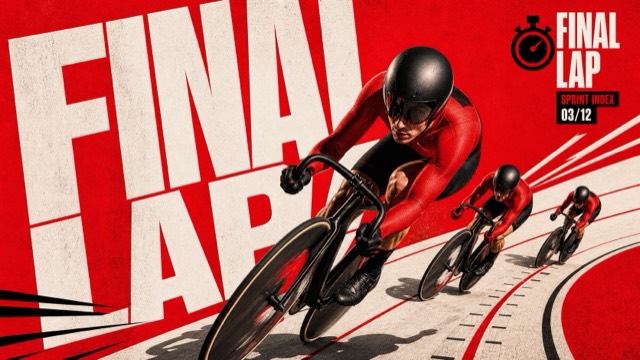
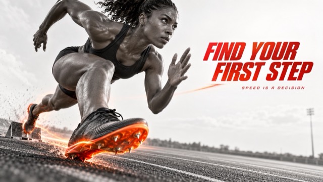
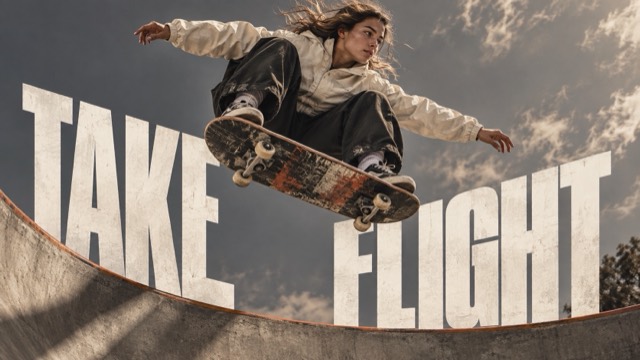
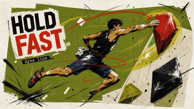
Type Posters
Monumental Editorial — Set 02
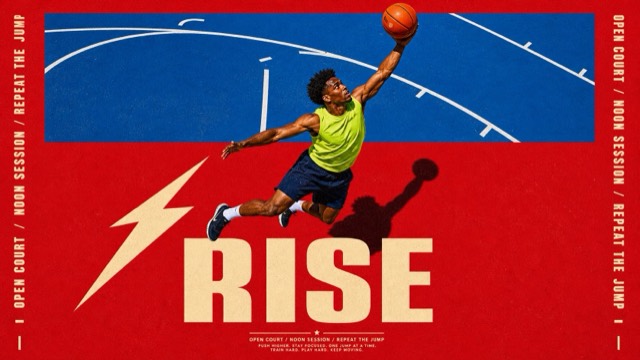
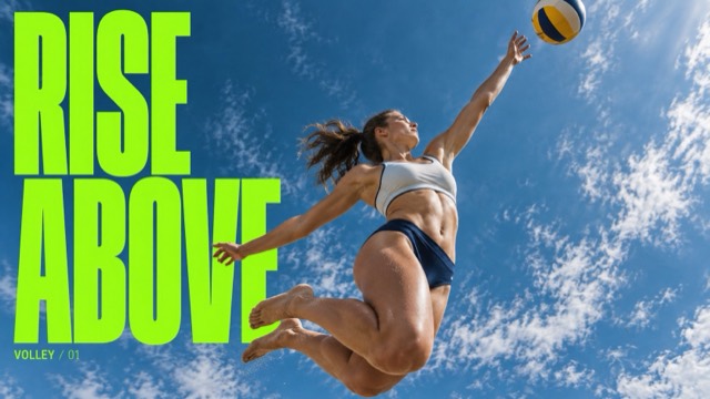
A cross-domain extension of monumental sports editorial typography: clean giant condensed white lettering collides with tactile botanical, musical, food, and chrome-product photography, each in a distinct palette and spatial arrangement.
Images are AI-generated with this style's prompt. Your results will vary by model and the details you enter.
Build your prompt
Fill in the details below, or leave them blank and the AI will choose what fits the style. Prompts stay in English because image models understand it best; the text you want shown on the image can be in any language.
Gemini and some tools cannot take a prompt from a link, so press Copy prompt first, then paste.
Full style rules
Style anchors
- [CORE] Premium photographic editorial poster with one strongly art-directed focal subject at an extreme, tactile scale.
- [CORE] Monumental heavy condensed uppercase sans-serif headline, white or cream, with clean graphic edges and clear complete words.
- [CORE] Deliberate shared depth between image and typography: precise overlaps, a meaningful gap, a counter, or a reflection integrates them into one composition.
- [CORE] Dramatic directional light and high tonal contrast reveal the subject material and shape without flattening the photographic detail.
- [CORE] Sparse hierarchy: one subject relationship, one short headline, large simple background fields, and decisive scale contrast.
- [FLEX] Content can be botanical, cultural, culinary, or industrial. Hands, a close face, or a pure object may dominate according to the concept; an athletic body is not required.
- [FLEX] Use each case palette as a new dominant atmosphere with one field color, white lettering, and material accents; warm taupe and rust are choices from the earlier set, not obligatory colors.
- [FLEX] Typography orientation, camera, crop, negative space, and the image-type interaction change with the subject. The four cases must have different compositional mechanics rather than one interchangeable template.
Do
- Let material or action directly determine the typography interaction.
- Keep clean high-contrast white or cream letter silhouettes.
- Use case-specific light and color while preserving the same editorial scale language.
Avoid
- Previous-set sports subjects or repeating the same warm gray grading.
- Replacing content without changing the underlying layout relationship.
- Extra words, punctuation drift, logos, watermarks, unreadable letter occlusion, or distressed graphic type.
Negative prompt
basketball player, sports campaign subject, runner, skater, diver, dancer, athlete uniform, original identity, Nike swoosh, old slogans, warm sepia grade across all cases, distressed typography, gritty paper overlay, interchangeable title layout, misspelling, extra punctuation, illegible primary headline, extra text, brand logo, watermark, duplicated objects, malformed hands, impossible instrument grip, implausible chair structure