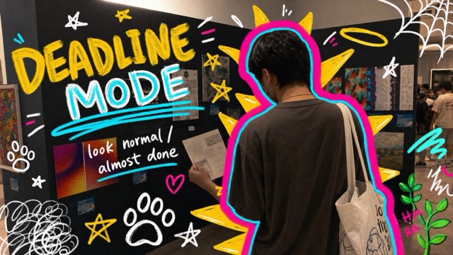
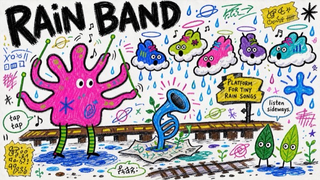
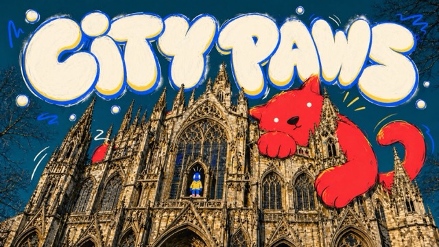
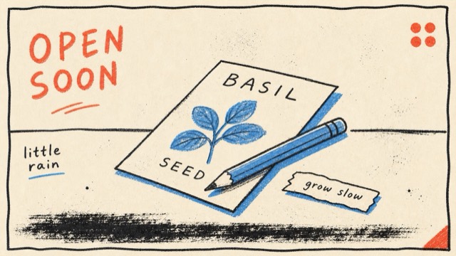
Photo + Doodle
Rough Ink Music Doodle Poster Style
A rough hand-inked poster style built from oversized dark green-black brush lettering, pale blush paper, hot pink secondary type, naive mascot drawings, teal and pink flat fills, sharp yellow burst marks, scattered music-note doodles, and scanned risograph-like print texture.
Images are AI-generated with this style's prompt. Your results will vary by model and the details you enter.
Build your prompt
Fill in the details below, or leave them blank and the AI will choose what fits the style. Prompts stay in English because image models understand it best; the text you want shown on the image can be in any language.
Gemini and some tools cannot take a prompt from a link, so press Copy prompt first, then paste.
Full style rules
Style anchors
- Pale blush paper background with a lightly scanned, warm off-white finish.
- Oversized rough brush headline in deep green-black ink, with broken edges and uneven pressure.
- Hot pink secondary typography placed as small stacked text blocks, labels, or date-like graphic notes.
- Flat naive mascot or figure drawings with thick scratchy outlines and simplified anatomy.
- Limited accent palette: deep green-black linework, hot pink fills, teal green fills, and acidic yellow bursts.
- Poster layout uses asymmetrical open space with separate floating illustration clusters rather than a boxed grid.
- Large title mass sits high or to one side while drawings orbit around it at different scales.
- Graphic energy comes from music notes, starbursts, brackets, scribbles, loose motion lines, and imperfect registration.
- Depth is almost flat, with playful scale distortion instead of realistic perspective.
- Texture shows dry ink, screenprint grain, speckled fills, and small gaps where color misses the outline.
- Text is treated as drawn poster matter, not as polished digital typography.
- Overall mood is playful, odd, wellness-adjacent, and music-event-like without becoming slick or corporate.
Do
- Use a handmade music-event poster feeling with wellness-adjacent oddness.
- Use giant rough dark brush lettering and small hot pink supporting labels.
- Use flat mascot drawings, oversized props, and playful scale distortion.
- Use teal and pink flat fills with one acidic yellow burst or sparkle.
- Keep the layout airy, asymmetric, and visibly printed on pale paper.
Avoid
- copying the source campaign headline, music prescription wording, platform badge, date range, ingredient label, or exact layout
- goji berries, medicine bowl, seated horned listener, green seated guitarist, same pink guitar, or same yellow lightning arrangement
- watermarks, usernames, creator IDs, app marks, QR codes, signatures, brand logos, or recognizable people
- photorealism, 3D rendering, glossy vector art, polished corporate typography, clean icons, gradients, or cinematic lighting
- dense scenery, realistic perspective, long readable paragraphs, luxury editorial mood, or a one-color monochrome palette
Negative prompt
watermark, username, creator ID, platform logo, app UI, QR code, signature, copied source headline, copied source English phrase, original date range, platform badge, goji berries, medicine bowl, seated horned listener, green seated guitarist, same pink guitar, exact yellow lightning layout, brand logo, licensed character, recognizable person, photorealism, 3D render, glossy vector art, clean corporate icon set, smooth gradients, cinematic lighting, airbrush shading, realistic anatomy, precise perspective, dense city scene, long paragraphs, beige monochrome design, luxury editorial design