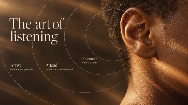
Editorial + Minimal
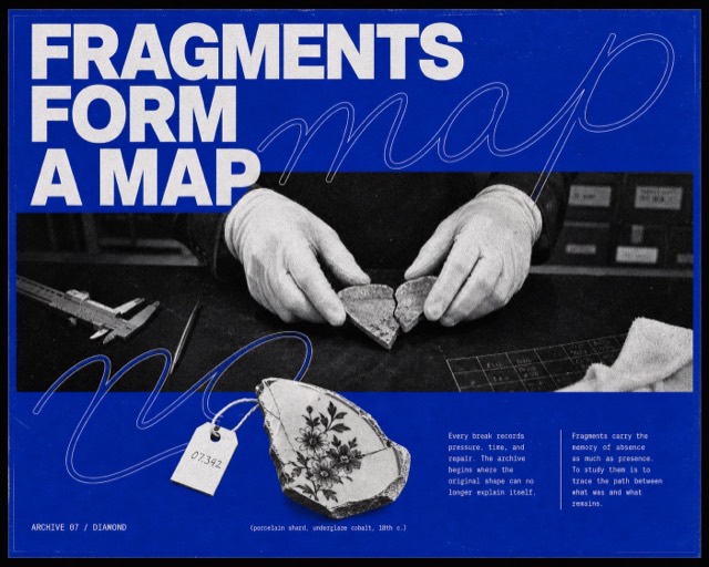
Cobalt Xerox Script Editorial Poster
A compressed, confrontational cobalt editorial poster system in which fragmented grotesk headlines, two enormous repeated outline-script words, an ambiguous macro halftone photograph, a dark flat Xerox cutout, and dense microcopy collide across nearly the entire page.
Images are AI-generated with this style's prompt. Your results will vary by model and the details you enter.
Build your prompt
Fill in the details below, or leave them blank and the AI will choose what fits the style. Prompts stay in English because image models understand it best; the text you want shown on the image can be in any language.
Gemini and some tools cannot take a prompt from a link, so press Copy prompt first, then paste.
Full style rules
Style anchors
- The poster artwork fills the raster nearly edge to edge with only a thin black keyline; there is no outer black presentation mat, floating card, wall mockup, or large safe margin.
- Page density is extremely high: typography, script, photo, cutout, and microcopy occupy roughly 88 to 94 percent of the usable poster, leaving only narrow cobalt seams rather than large calm blue fields.
- The supplied all-caps headline is forcibly split into two separate monumental neo-grotesk blocks: the opening words crowd the upper band and the remaining words reappear below the photo, never as one tidy complete title at the top.
- One selected word from the new headline is written twice as an enormous legible hairline cursive outline, each instance wider than the page and visibly cropped, crossing behind and in front of the headline and photo boundaries.
- A single wide black-and-white photo panel uses an ambiguous extreme macro crop with almost no environmental context; surface, gesture, or anatomy fills the frame at confrontational scale instead of showing a normal documentary scene.
- The photograph has aggressive Xerox and coarse newspaper-halftone treatment with visibly enlarged dots, crushed carbon-black shadows, chalk-white highlights, and rough tonal breakup.
- A single irregular, mostly black cutout object intrudes across the lower headline and the gap between two microcopy columns; it is flat and shadowless, never a centered product hero on empty blue.
- Two dense narrow columns of tiny white editorial text sit hard against the bottom area, each forming a compact block of roughly eight to twelve short lines, partially crowded by the cutout.
- The palette is restricted to intense cobalt blue, paper white, and carbon black; the blue behaves like uneven spot ink and the monochrome elements look physically reproduced.
- All layers remain flat and print-based with deliberate collisions: letters are cropped, script crosses the photo, the cutout obscures type, and no element receives realistic depth, bevel, or drop shadow.
- Coarse paper tooth, toner freckles, halftone dots, ink starvation, and scan grain remain clearly visible across the blue field, white letters, photo, and cutout while preserving the main headline.
- The mood is unresolved, cerebral, abrasive, and poetic, closer to an experimental photocopied poster or independent art journal than to a clean archival infographic.
Do
- Use aggressive density, blunt type collisions, cropped letterforms, and asymmetry.
- Repeat one legible cursive outline word twice at larger-than-page scale.
- Use one ambiguous macro monochrome subject detail and one irregular dark shadowless cutout.
- Split the fresh headline between the upper and lower page and supply enough prose for dense twin columns.
- Make coarse halftone, toner freckles, paper tooth, and uneven blue ink visible at first glance.
- Preserve the horizontal macro-photo window and cutout-crowded footer in both ratios.
Avoid
- Avoid photorealistic full-color imagery, smooth grayscale, cinematic color grading, or glossy commercial polish.
- Avoid gradients, neon glows, lens flares, chromatic aberration, 3D type, bevels, and cast shadows.
- Avoid clean infographic spacing, large empty blue fields, centered product-hero layouts, tidy museum labels, and generous safe margins.
- Avoid putting the complete headline at the top or reducing the cursive lettering to a small abstract loop.
- Avoid normal documentary scenes, medium shots, explanatory environments, and fully visible people.
- Avoid circular product medallions floating by themselves, realistic object shadows, decorative sticker clutter, multiple product shots, comic panels, or scrapbook layering.
- Avoid copying the source person's face, eye crop, pinecone-like object, text, masthead, or exact line breaks.
- Avoid logos, watermarks, usernames, QR codes, signatures, and platform marks.
Negative prompt
Outer black presentation mat, floating poster card, wall mockup, room scene, clean infographic, archival placard, museum label, large empty blue field, generous safe margin, complete headline only at top, small abstract script loop, only one cursive repetition, conventional documentary scene, medium shot, fully visible person, centered product hero, circular medallion floating alone, realistic object shadow, source face or eyes, pinecone, seed cone, source slogan, source masthead, copied body text, copied line breaks, logo, watermark, username, signature, QR code, platform mark, full-color photography, additional hues, gradient, glossy finish, smooth digital grayscale, 3D type, extrusion, bevel, glow, cinematic lighting, lens flare, sticker clutter, comic panels, illegible main headline.