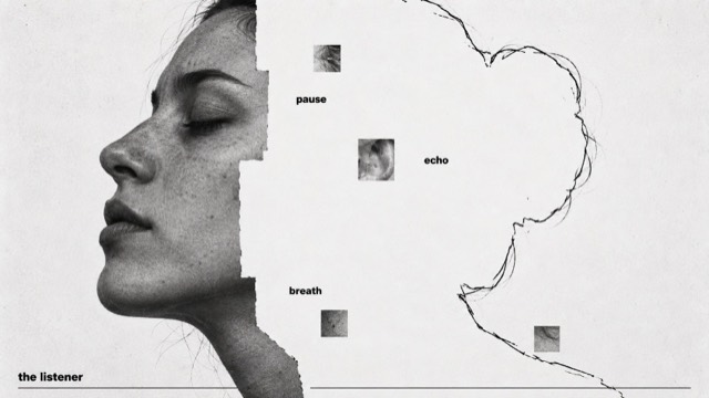
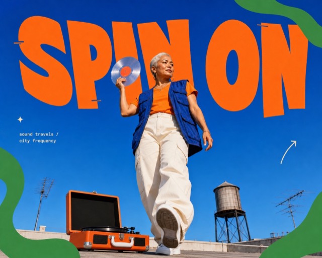
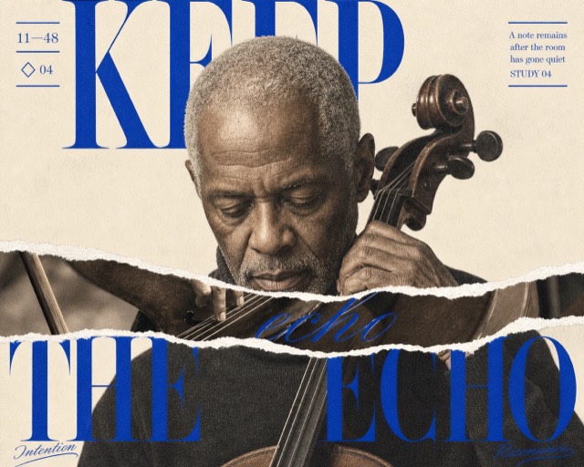
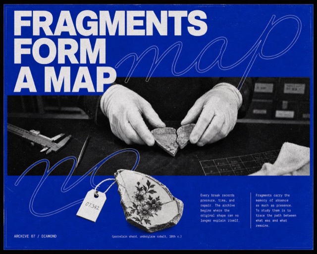
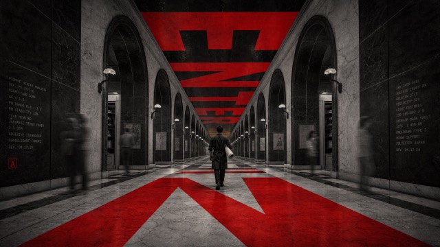
Editorial + Minimal
Amber Orbit Editorial
Intimate warm macro photography, grazing amber light, ivory serif typography and fine overlapping orbital lines turn tactile details into quiet editorial stories about attention, making and time.
Images are AI-generated with this style's prompt. Your results will vary by model and the details you enter.
Build your prompt
Fill in the details below, or leave them blank and the AI will choose what fits the style. Prompts stay in English because image models understand it best; the text you want shown on the image can be in any language.
Gemini and some tools cannot take a prompt from a link, so press Copy prompt first, then paste.
Full style rules
Style anchors
- [CORE] Let one intimate, oversized photographic detail dominate the frame; render it as a tangible surface with real depth, an assertive crop and selective focal clarity.
- [CORE] Keep a continuous warm tonal family of ivory, sand, honey amber, tobacco and deep brown, with luminous grazing highlights against quiet, sufficiently dark regions for pale lettering.
- [CORE] Pair fine ivory high-contrast serif display lettering with small, restrained sans-serif supporting copy; preserve a quiet editorial hierarchy and ample breathing room.
- [CORE] Overlay a small family of hairline, translucent ivory circles or circular arcs, nested, offset or tangent, that visibly relate to a meaningful contour or action in the photograph.
- [CORE] Preserve tactile microtexture at the focal plane, gentle optical softness elsewhere and a few subtle horizontal light-drag veils across peripheral photo areas; keep the graphic lines and wording clear.
- [FLEX] Let the subject's meaning determine the geometry: circles can suggest listening, rotation, refraction or unfolding, with projected ellipses permitted when motivated by photographic perspective.
- [FLEX] Reposition subject, headline and annotations for each case and ratio; asymmetry, edge bleed and off-center visual balance may change freely while the warm photographic and ivory-line family stays recognizable.
- [FLEX] Choose title line breaks and annotation placement for the available quiet space; labels may follow the orbital rhythm without forcing a fixed top-to-bottom timeline or copying the source.
Do
- Use a distinct photographic viewpoint and meaningful orbital relationship for each case.
- Inspect exact wording, natural anatomy where present, focal texture, line delicacy and text contrast.
- Keep both ratios in one coherent family while exploiting the available width or height.
Avoid
- Do not reproduce the source person's identity, facial crop, longevity headline or monthly benefit claims.
- Do not turn the four cases into the same centered title and vertically nested-circle template.
- Do not add cards, decorative borders, pseudo-scientific scales, reticles, grids, numerals or unrelated symbols.
- Do not use thick glowing rings, neon colors, flat vector subjects, plastic CGI materials, heavy grain or global motion blur.
- Do not add copy, logos, watermarks, punctuation or brand marks beyond the seven supplied strings.
Negative prompt
original woman's face or profile, Your longevity journey, Month One, Month Two, Month Three, skincare benefit claims, copied centered month timeline, extra words, extra punctuation, misspelling, duplicated text, tiny illegible copy, text on blown highlights, opaque text cards, brand logo, watermark, QR code, UI, frame, ruler, grid, reticle, thick luminous circles, neon rainbow palette, flat vector subject, plastic CGI texture, waxy skin, malformed hands, heavy grunge, global blur, excessive sharpening