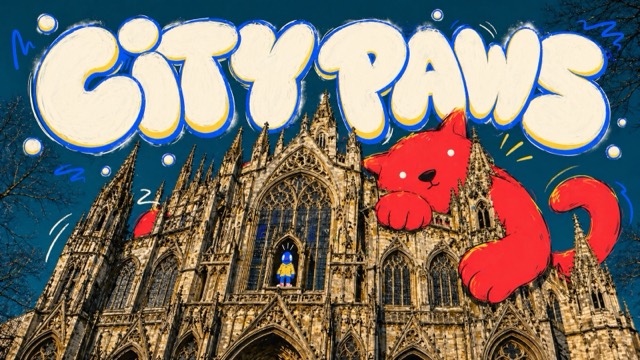
Photo + Doodle
Crayon Catalog Doodle Poster Style
A sparse product-catalog poster system rendered like a child's wax-crayon drawing on folded white paper: huge rough red headline letters, simple green and warm-color doodle subjects, tiny black catalog captions, and lots of quiet blank space.
Images are AI-generated with this style's prompt. Your results will vary by model and the details you enter.
Build your prompt
Fill in the details below, or leave them blank and the AI will choose what fits the style. Prompts stay in English because image models understand it best; the text you want shown on the image can be in any language.
Gemini and some tools cannot take a prompt from a link, so press Copy prompt first, then paste.
Full style rules
Style anchors
- White paper background with visible fold or crease lines, faint paper grain, and large untouched blank areas.
- Wax-crayon or oil-pastel texture with broken coverage, grainy pressure marks, and irregular edges.
- Huge uppercase red headline letters dominate the top or side of the poster and look hand-colored, not typed.
- The main illustration is simple, naive, and flat, built from broad scribbled shapes rather than realistic perspective.
- Green is used as the main organic mass or accent color, balanced by red headline text, brown outlines, and small orange or blue details.
- Catalog-ad hierarchy: one large hero object or scene, one or two tiny secondary objects, and small black product-label text blocks.
- Small black captions use clean sans-serif catalog typography, positioned near the drawn objects with price-like microcopy.
- Subject scale is oversized and centered low or middle, with secondary doodles floating around it in sparse space.
- Line quality is uneven, childlike, and blunt, with white gaps inside color fills and no polished vector edges.
- Lighting is flat and paper-based; shadows are minimal or absent, and depth is implied only by overlapping crayon shapes.
- Mood is playful, handmade, relaxed, and gently absurd, like a catalog page redrawn by memory with crayons.
- Composition stays sparse and poster-like; it should never become a dense illustrated scene or polished commercial rendering.
Do
- Use rough red uppercase crayon headline lettering as a major visual anchor.
- Draw the main subject with thick, grainy crayon strokes and visible paper flecks.
- Add tiny black catalog labels near objects to create the retail-poster contrast.
- Preserve large white paper fields and a visible fold line.
- Use simple everyday objects, relaxed domestic scenes, or playful product moments.
Avoid
- Do not copy any source brand, product names, price labels, logo placement, or original headline text.
- Do not draw a reclining reader on a green sofa or the same shelf-and-plant setup.
- Do not make the result look like clean vector illustration, polished ad rendering, watercolor, or comic art.
- Do not create a busy room full of objects, realistic furniture perspective, or dense catalog page.
- Do not include QR codes, usernames, watermarks, platform marks, or real retailer logos.
Negative prompt
IKEA, IKEA logo, blue-yellow logo, copied brand marks, Koppla, Skogsta, Soderhamn, green two-seat sofa, reclining person reading, exact wall shelf and plant arrangement, copied French copy, copied prices, source product labels, signature, watermark, username, QR code, platform logo, clean vector art, realistic furniture render, watercolor, comic panel, polished digital marker, dense room scene, photoreal person, glossy 3D object, exact source composition