Type Posters
Cream Curve Editorial
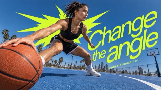
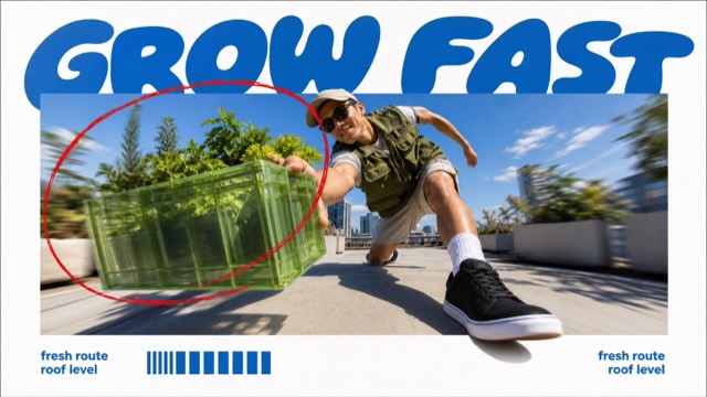
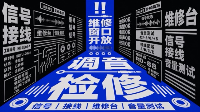
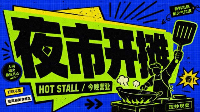
Sunlit photographic editorial posters shaped by monumental condensed cream lettering, elastic curves and deliberate subject/type depth exchanges. Each theme gives the lettering a different spatial job.
Images are AI-generated with this style's prompt. Your results will vary by model and the details you enter.
Build your prompt
Fill in the details below, or leave them blank and the AI will choose what fits the style. Prompts stay in English because image models understand it best; the text you want shown on the image can be in any language.
Gemini and some tools cannot take a prompt from a link, so press Copy prompt first, then paste.
Full style rules
Style anchors
- [CORE] Monumental warm-cream uppercase lettering is an active spatial structure: extremely condensed heavy sans-serif glyphs with elastic vertical stretching, slant and smoothly warped contours. It dominates the graphic area while the complete headline remains readable.
- [CORE] Real sunlit editorial photography carries the image: direct hard daylight, dimensional natural detail, rich deep cool or earthy shadows and a small vivid color accent, contrasted with flat light-cream letterforms.
- [CORE] Integrate photograph and lettering through controlled foreground/background exchanges. At least one clear subject/type overlap must make depth legible while protecting the main action and crucial letters.
- [FLEX] Let the theme determine the typography path: a banking bend, radial groove, diving sweep or upward harvest fan are possibilities, not a shared layout.
- [FLEX] Choose the camera height, subject scale, focal placement, useful quiet areas and edge bleed for each case; a centered close-up portrait is not required.
- [FLEX] Supporting cream curves may emerge from the action, scenery or letter terminals when useful. They are optional, graphic and sparse, without a mandatory ribbon inventory.
- [FLEX] Adapt the dominant dark photographic hue and accent to the case while retaining warm light lettering, strong tonal separation and sunlit realism.
- [FLEX] Recompose for each aspect ratio so that the same idea has a deliberate portrait and landscape expression instead of a mechanical crop.
Do
- Make cream letters feel spatially elastic and imposing.
- Keep the photographed action or object instantly understandable.
- Use deliberate case-specific shape logic and purposeful overlaps.
- Keep authentic small-scale photographic detail.
Avoid
- Repeating the source selfie pose or the same top/bottom word sandwich in every case.
- Ordinary straight title bars over unrelated stock photography.
- Decorative curves without a link to action or type.
- Fake 3D lettering, grunge, excessive labels or logo imitations.
Negative prompt
Misspelled or repeated headline, unrelated extra copy, original subject or source identity marks, malformed anatomy, repeated limbs, impossible machinery, unmotivated ribbons, identical case layouts, generic straight heading, 3D beveled letters, gradients in type, cartoon treatment, CGI skin, halftone, grunge, artificial edge sharpening, borders, watermarks.