Editorial + Minimal
Duotone Step Window Editorial
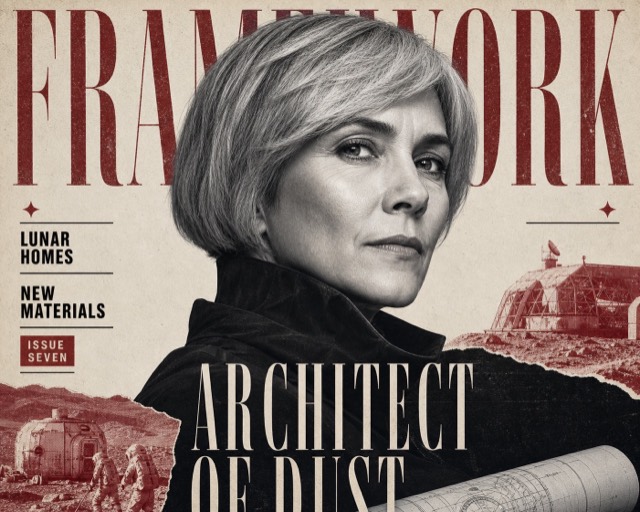
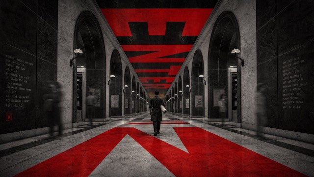
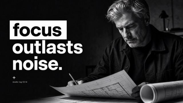
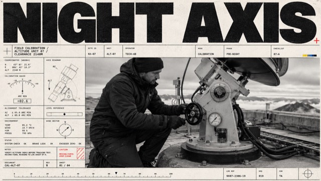
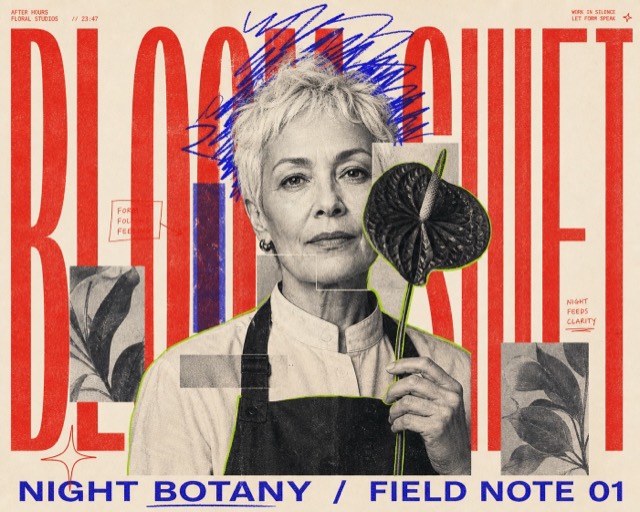
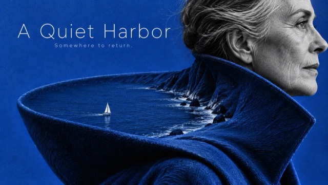
Oversized regular-weight grotesk typography, emphatic event numerals and a continuous grainy action photograph selectively re-inked through hard-edged stepped color windows.
Images are AI-generated with this style's prompt. Your results will vary by model and the details you enter.
Build your prompt
Fill in the details below, or leave them blank and the AI will choose what fits the style. Prompts stay in English because image models understand it best; the text you want shown on the image can be in any language.
Gemini and some tools cannot take a prompt from a link, so press Copy prompt first, then paste.
Full style rules
Style anchors
- [CORE] An oversized regular-to-medium weight neo-grotesk headline and emphatic date numerals build an asymmetric, tightly set editorial hierarchy; no heavy condensed display, serif, outline or hand-lettered headline.
- [CORE] One continuous action photograph crosses hard rectangular or stepped masks: outside the light window it is black-on-saturated-base duotone, inside it is contrasting spot-ink-on-neutral-white. Image geometry remains aligned through every boundary.
- [CORE] Flat vivid color fields, white windows and restrained photographic print grain create a sharp graphic/photographic contrast; no natural-color portrait inset or photorealistic paper mockup.
- [FLEX] Design the stepped window to answer the action: its scale, position, contour and number of turns can change; the reference's exact silhouette and cyclist diagonal are not fixed.
- [FLEX] Choose a vivid base and a contrasting spot ink for each theme, keeping black text and light-window contrast strong. Blue and red are a valid example, not a compulsory universal palette.
- [FLEX] Recompose headline line breaks, date stack and photo crop for each ratio; all required wording remains readable while purposeful photographic edge cropping is allowed.
- [FLEX] Use sparse factual-looking event metadata, rules or open space as needed; do not replicate source sponsors, venues, footer density or brand signage.
Do
- Use mask boundaries as compositional responses to motion or process.
- Retain photographic print grain at a fine scale while keeping vivid flat ink fields.
- Explore different image/text relationships across themes and ratios.
Avoid
- Disconnected photo insets or duplicated subjects inside and outside the mask.
- Serif, distressed heavy block or handwritten main typography.
- Natural-color skin, gradient glows, 3D graphic frames, antique paper and random decorative clutter.
Negative prompt
No source event, sponsor, watermark, source portrait or cycling scene; no natural-color inset, repeated person, disconnected anatomy, transparent canvas, generic scrapbook boxes, serif lettering, pastel wash, grunge scratches or unreadable required title.