Editorial + Minimal
Red Monochrome Editorial Grid
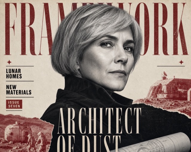
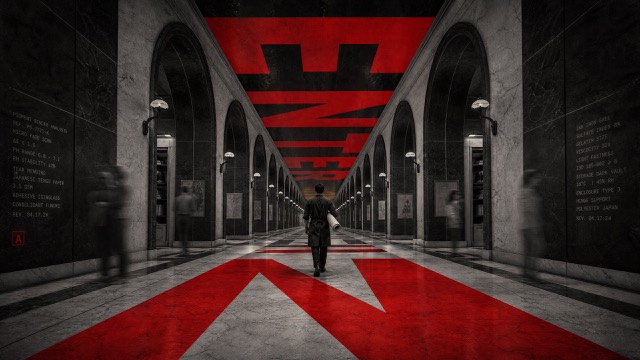
A confrontational editorial-poster system built from monumental condensed typography, red-and-black duotone photography, rigid off-white gutters, and paper-like ink grain. The design treats photographic crops and type blocks as equal grid modules rather than placing a single hero image behind type.
Images are AI-generated with this style's prompt. Your results will vary by model and the details you enter.
Build your prompt
Fill in the details below, or leave them blank and the AI will choose what fits the style. Prompts stay in English because image models understand it best; the text you want shown on the image can be in any language.
Gemini and some tools cannot take a prompt from a link, so press Copy prompt first, then paste.
Full style rules
Style anchors
- Use a rigid modular poster grid separated by thick, imperfect off-white paper gutters that stay visible as structural lines.
- Treat the photo crops, black type fields, and red graphic fields as adjacent modules with hard rectangular boundaries.
- Use only ink-black, saturated signal red, and rough off-white paper, with no extra hue or smooth color gradient.
- Render photography as coarse high-contrast red-and-black duotone, with pronounced screenprint dots, xerox grain, and ink speckle.
- Crop subjects aggressively into fragments such as forehead, profile, shoulder, torso, object, or silhouette; do not make a conventionally centered beauty portrait.
- Set the main headline in extremely heavy condensed uppercase sans-serif, close to black, enlarged until it presses against module edges or crops slightly.
- Let one or two giant word blocks create the visual base, while a smaller red insert panel provides a sharp secondary narrative fragment.
- Leave the off-white gutter system mostly unprinted so it acts as breathing room around the black and red modules.
- Use a small black pictogram, scan-like mark, or simplified silhouette as an occasional counterpoint to the huge type.
- The mood is blunt, restless, handmade, politically charged, and print-driven rather than glossy, cinematic, or clean corporate.
Do
- Use uneven ink grain and high-contrast duotone image fragments.
- Let heavyweight text fill its module and press against the grid boundaries.
- Use hard-edged crops, thick paper gutters, and direct visual tension.
Avoid
- Do not reuse the source face, eyes, hand-to-face gesture, phrase, self-conflict concept, or exact layout.
- Do not introduce extra colors, glossy full-color photography, soft shadows, or sleek corporate gradients.
- Do not add busy microcopy, many icons, delicate typography, watermarks, or illegible accidental text.
Negative prompt
No copied person, copied eyes, copied hand-to-face gesture, copied phrase, copied self-conflict premise, copied grid positions, logo, watermark, QR code, brand name, full-color photography, blue, green, purple, gradient, glossy product lighting, sleek UI, serif or script lettering, thin type, 3D text, crowded microcopy, extra panels, distorted anatomy, or illegible text.